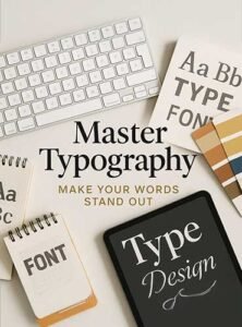
6 Essential Tips for Beautiful, Effective Design
Typography is more than just arranging letters on a page — it’s the heartbeat of good design. The right typography can make your message resonate, evoke emotion, and elevate your visuals from ordinary to unforgettable. Whether you’re designing for print, web, or branding, mastering typography is an essential skill.
Why Typography Matters
Typography shapes the way your audience experiences your content. It guides the eye, creates hierarchy, and sets the tone. A beautifully designed poster or website can fall flat if the type feels awkward or inconsistent. On the other hand, even simple designs can shine with smart typography choices.
Key Principles of Good Typography
1. Choose the Right Typeface
Every typeface has its own personality. Serif fonts like Garamond or Baskerville feel classic and formal, while sans-serif fonts like Helvetica or Futura feel clean and modern. Script fonts can add elegance but should be used sparingly. Choose a typeface that aligns with your message and brand.
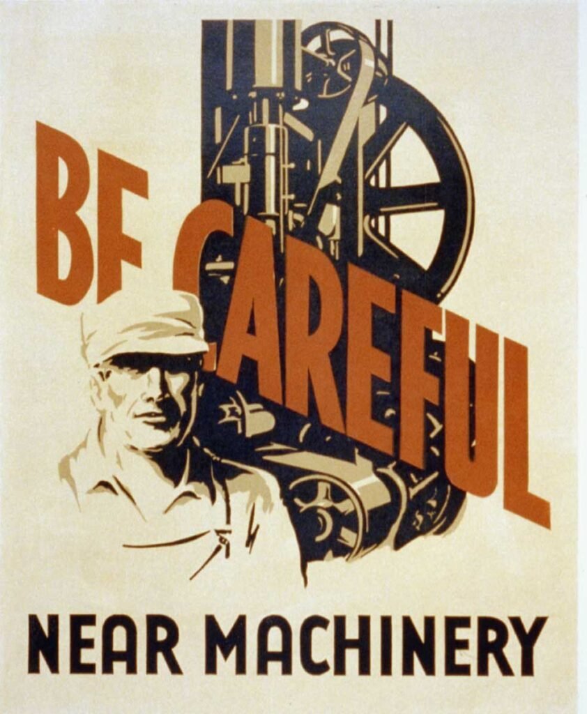
2. Hierarchy is Everything
Good typography creates a visual path for your reader. Use different font sizes, weights, and styles to establish a clear hierarchy. Headlines should grab attention, subheadings guide the eye, and body text should be easy to read.
3. Mind the Spacing
Kerning (space between letters), leading (space between lines), and tracking (overall letter spacing) are crucial. Tight or loose spacing can dramatically affect readability. Aim for balance and harmony.
4. Limit Your Fonts
A general rule: stick to 2-3 typefaces per design. Too many fonts create clutter and confusion. Pair contrasting fonts — like a bold sans-serif headline with a clean serif body text — for a polished look.
5. Pay Attention to Alignment
Left-aligned text is usually easiest to read. Centered text works well for short bits like headlines or invitations. Avoid fully justified text on the web, as it can create uneven word spacing.
6. Color and Contrast
Your type needs to stand out against the background. High contrast improves readability, while low contrast can strain the eyes. Play with color carefully — it can emphasize or diminish the impact of your words.
Typography Trends to Watch
- Variable fonts: Flexible and responsive type that adjusts weight and width.
- Maximalist type: Big, bold, expressive fonts are making a statement.
- Retro revivals: Vintage-inspired typography is back in modern design.
Final Thoughts
Good typography isn’t just about looking pretty — it’s about communication. When done right, it strengthens your message, builds brand recognition, and makes your designs memorable. Keep practicing, keep experimenting, and let your type do the talking.